.svg)
What is a Webflow Styleguide?

Key takeaways
- A style guide defines all visual rules—colors, typography, spacing, and components—to keep a website consistent.
- Webflow style guides differ from Figma’s because Webflow turns styles into global, reusable elements tied to the live site.
- Most teams design the guide in Figma, then implement it in Webflow using global classes and swatches.
- A solid Webflow style guide includes color systems, typography, spacing scales, and reusable UI components.
- Clear spacing and layout rules improve readability, accessibility, and overall UX across devices.
- Building your style guide in Webflow speeds up development and keeps new pages visually consistent.
In web design, a style guide (or a styleguide) is a collection of rules, standards, and guidelines about how visual assets should be made, assembled, and maintained to give the brand a consistent look across all of its creations. Style guides can be crafted for different kinds of work - illustration, writing, UX/UI, branding, and more.
When we say ‘Webflow styleguide’, we mean a Webflow page built in a special way, which describes how all of the design elements and components of a specific Webflow website are used. It contains all of the basic building blocks that make up a website - typography (headings, paragraphs), colors, buttons, form elements, icons, and so on. Ultimately, a styleguide serves as a reference and a single source of truth for developers building a Webflow website.
What’s the purpose of a style guide in Webflow?
A Webflow style guide is a collection of all the building blocks of a website. It includes (but is not limited to) all of the following:
- Typography settings (all headings, paragraphs, rich text fields)
- Color palette
- Button and CTA variants
- Form element variants
- Icon library
- Component library (for more complex parts of a website)
In its essence, a styleguide ensures the completeness, consistency, and reusability of design elements, so that anything made for a website looks and feels the same.
Why is it important to use style guides in Webflow?
Style guides in Webflow are important because they serve multiple purposes, including:
Design Consistency
Design consistency is crucial for a coherent brand image and a positive user experience. When all elements of your website are aligned with your established style guide, they form a cohesive whole that reinforces your brand identity and messaging. Consistent design is not just about aesthetics; it also improves usability by providing clear visual cues that help users navigate your site intuitively.
More Efficient Development
A clear and comprehensive Webflow style guide acts as a blueprint for your development team. It eliminates guesswork, reduces the time spent on decisions about design and development aspects, and prevents costly mistakes or rework due to misunderstandings. When everyone on the team knows exactly what standards to adhere to, workflow becomes more streamlined and efficient, leading to faster project completion and higher quality outcomes.
A Smoother Team Collaboration
Style guides provide a universal language that all team members can speak, from designers and developers to content creators and project managers. This shared understanding fosters better communication, reduces conflicts, and facilitates smoother collaboration across different roles and departments. When team members use the same terminology and understand the same principles, they can work together more cohesively and effectively.
Scalability
Having a well-documented style guide allows for seamless scaling of your website. As your business grows and your web presence expands, having a style guide means that new team members can quickly get up to speed with your design standards. It’s also invaluable for maintaining consistency when updating or expanding your website, ensuring that new additions align with your established brand identity.
Problem Solving
When issues or inconsistencies arise during development, a style guide provides a clear reference point to identify and rectify problems. It offers concrete standards against which all design and development decisions can be evaluated, which facilitates more objective and effective problem-solving. This can save time and resources in the long run and contribute to higher quality outputs.
What should a Webflow style guide include?
A comprehensive Webflow styleguide encompasses many elements, each crucial for establishing a consistent and effective design language. Here’s what a thorough Webflow style guide should include:
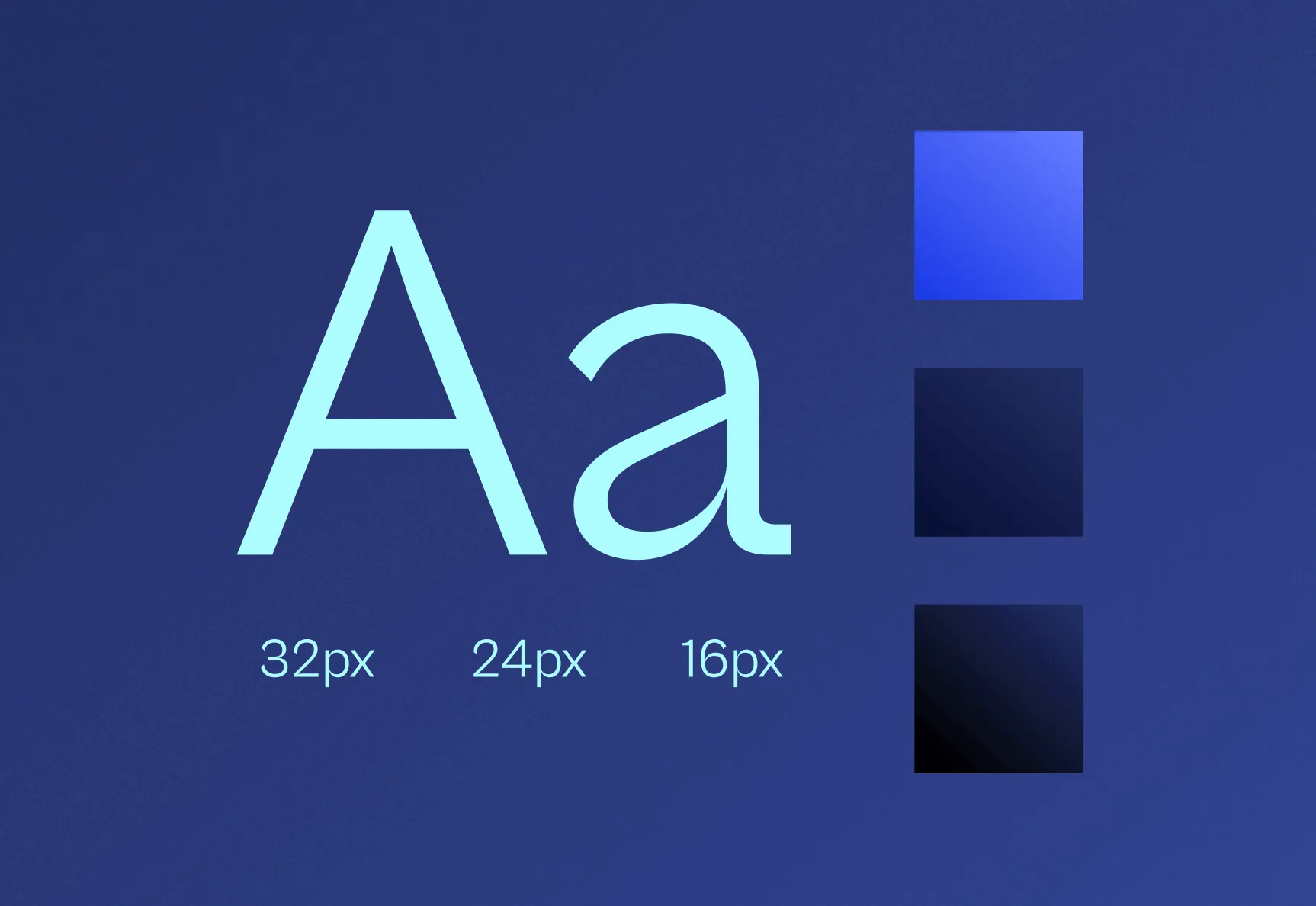
Typography
Typography sets the tone for your content and is a fundamental aspect of your brand identity. Your style guide should clearly specify all the fonts used on your website, including headers and body text, along with the hierarchy and sizing for each type. This consistency in typography ensures that your content is legible, accessible, and visually appealing across all pages and devices.
Colors
Color plays a vital role in evoking emotions and building brand recognition. Your Webflow style guide should specify your entire color palette, including your primary colors, secondary colors, accent colors, and background colors. It should also outline guidelines for how these colors are to be used together, which is crucial for maintaining visual harmony and reinforcing your brand identity across all web pages.
Spacing and Layout
Spacing and layout guidelines help maintain a clean, organized look across your website. This includes specifying margins, padding, and the grid system used. Consistent spacing ensures that your content is presented in an uncluttered and easy-to-navigate manner, enhancing user experience.
Visual Elements
This section should cover all the visual elements used on your website, such as icons, illustrations, photography styles, and any other recurring visual components. Setting standards for these elements ensures a cohesive visual language that strengthens your brand identity.
UI Components
Your style guide should include detailed specifications for all the User Interface (UI) components used on your website, such as buttons, forms, navigation bars, modals, and tooltips. This includes their design, states (like hover, active, disabled), and behaviors, ensuring that these elements are used consistently throughout the website.
Grid System
The grid system is the structural foundation of your website’s layout. Your style guide should specify the type of grid used (e.g., fixed, fluid, or responsive), the number of columns, and the spacing rules. This ensures that your content is displayed in a structured, balanced, and responsive manner across different screen sizes and devices.
What are the best Webflow styleguide templates?
There are several Webflow styleguide templates readily available, that make it very easy to set up your styleguide. The key is to pick the one that best suits your specific needs. We’ve put together a list of some of our favorite styleguide Webflow templates:
Novus Styleguide
The Novus Styleguide is an essential Webflow template for developers and designers looking to establish a cohesive design system. It’s comprehensive with various sections, including an overview, typography, colors, buttons, forms, cards, and modals. This template is user-friendly and intuitive, making it straightforward to document and showcase your design system within Webflow. Its adaptability is a plus, allowing customization to fit different brand identities.
Mona Styleguide
The Mona Styleguide is a meticulously crafted Webflow template, perfect for developers aiming to create a consistent design system. It includes a variety of sections such as overview, typography, colors, buttons, forms, and more. This template is straightforward to use and can be easily adapted to suit your brand’s identity.
Brutalist Styleguide
The Brutalist Styleguide is a distinctive Webflow template for those favoring a bolder design aesthetic. It provides a comprehensive design system with sections for typography, colors, buttons, and forms, and it can be adapted to align with your brand identity. It’s user-friendly and straightforward to use, making it accessible for web designers and developers who like to work with Webflow. You can use this for web platforms, mobile applications, and print media, giving it a slight edge over the other templates in this list.
Core Styleguide
The Core Styleguide Webflow template is an efficient tool for organizing and presenting design components like typography, colors, and buttons. It’s adaptable, allowing for customization to match different brand identities. Its user-friendly design makes it accessible for a wide range of users. This template is suitable for individual designers, teams of designers, and even marketing teams. It’s perfect for those who want an intuitive system for managing and presenting design elements within Webflow.
Webflow Styleguide: Step-By-Step Instructions
Creating a Webflow styleguide is a fairly straightforward process, especially if you already have a design system for your brand in Figma. There are two main approaches: starting from scratch, or using a template. If you’re starting fresh, you’ll need to set up your brand’s visual language from the beginning, which requires a good understanding of your brand identity and Webflow’s design tools.
But since we want to show you the fastest possible way, we’ll go with using a Webflow template for creating our styleguide. To create a Webflow styleguide using a template, follow these steps:
- Log in to your Webflow account
- Go to ‘Templates’ in the Webflow Dashboard and search for a styleguide template. I’ll use the Novus template for this demo.
- You can preview the template before cloning. Hover over it and click Preview, then click ‘Get template’, if you like it.
- Clicking it will automatically open your Webflow dashboard and ask you to create a new project using this template.
- Give your project a name and click ‘Create project’.
- Now you’ll be taken to the Webflow Designer, where you can edit your styleguide template to match your brand design.
- From the lefthand side, you can add or remove elements to suit your style guide requirements.
- All elements can be edited by clicking on them and using the Style panel on the right-hand side.
How to Create Your Own Webflow Styleguide from Scratch
If you’d rather build your styleguide from scratch in Webflow, that’s definitely doable. You just need to start with a blank project and set up each section manually. Here’s how to approach it, step by step:
Step 1: Set Up a New Blank Project
Log in to your Webflow account and create a new project. Choose ‘Blank Site’ so you’re starting fresh. Give it a name like ‘Brand Styleguide’ so it’s easy to find.
Step 2: Define Your Global Styles First
Before adding any content, set your global typography and color styles. Go to the Style Manager in the Designer and define your heading styles (H1–H6), paragraph styles, and any text link styles. For colors, go to the Color Swatches panel and save your brand palette (primary, secondary, accent, neutrals) as named swatches so you can reference them throughout.
Step 3: Build Each Section as a Separate Block
Structure your styleguide as a long-scroll single page, with each section dedicated to one design element. A typical structure looks like this:
- Typography (all heading levels, body text, captions, links)
- Colors (swatches with hex codes and usage notes)
- Buttons (all variants: primary, secondary, ghost, disabled)
- Form elements (inputs, dropdowns, checkboxes, radio buttons)
- Icons (your icon library displayed in a grid)
- Components (cards, modals, navigation, hero sections)
For each section, show the component in use alongside the specs: class names, colors, sizes, and spacing values.
Step 4: Use Symbols for Reusable Components
Any component you use more than once should be turned into a Symbol (now called Components in newer Webflow versions). This ensures that when you update the master component, all instances across your styleguide and main site update automatically.
Step 5: Add Annotations Directly on the Page
Add text blocks next to each element to explain its usage. Include things like: when to use this button variant, what the class name is, the hex value of each color, or which font weight to use for subheadings. This turns your styleguide into a living reference document, not just a visual showcase.
Step 6: Publish and Share the Link
Once your styleguide is built, publish it to a Webflow subdomain or your own domain. Share the link with your design and development team so everyone has access to the same reference. You can also lock the page behind a Webflow password to keep it internal.
Summary
In conclusion, a Webflow style guide is an indispensable tool for any web design project. It ensures consistency, efficiency, and quality in design and development processes. By following the steps and guidelines provided, you can create a comprehensive style guide that not only streamlines your workflow but also significantly enhances the final product. Whether you’re working alone or as part of a team, a style guide is your roadmap to a successful, cohesive, and effective web presence. Need assistance setting up your own style guide? Don’t hesitate to feel free to hit us up!
Before you make your next move, run a free AI website audit with Foresight to see exactly where your website stands on performance, SEO, and user experience.
FAQs about Webflow Styleguides
How does a Webflow style guide improve collaboration between designers and developers?
A Webflow style guide establishes shared design standards directly within the build environment, allowing both designers and developers to work from the same visual and functional references. This alignment reduces miscommunication, speeds up development, and ensures consistency across the project.
Can a Webflow style guide be exported or integrated with other platforms?
Webflow style guides cannot be exported as standalone files, but components, classes, and style definitions can be duplicated across Webflow projects. For integration, designers often reference these guides manually when synchronizing with tools such as Figma or development frameworks.
What are the differences between a Webflow component and a global class?
In Webflow, a component is a reusable UI element saved as a block, like a button or form, while a global class applies consistent styling to different elements. Global classes control design attributes, whereas components control structure and content consistency.
Are there limitations to using Webflow for enterprise-level style guides?
For enterprise projects, Webflow may face constraints in version control, team permissions, and complex integration workflows. While ideal for visual consistency, teams might need external tools or systems to manage advanced documentation and design governance.
How does using a Figma-to-Webflow plugin streamline the style guide creation process?
The Figma-to-Webflow plugin transfers design elements like text styles, colors, and layout structures into Webflow, reducing manual duplication. This accelerates development and preserves design accuracy from prototype to build phase.
Ljubisa Momcilovic
Ljubisa is a Webflow developer at Flow Ninja. He is also an avid fan of Japanese language and culture.

Foresight website audit
Enter your website URL and get free website audit report in 2 minutes.
Continue reading


.webp)
Ready to escape your CMS nightmare
100+ successful migrations. 0 ranking disasters at launch. One embedded team that's done this before.