.svg)
10 Bad UX vs Good UX Design Examples for Websites
Key takeaways
- First impressions form in 50 milliseconds. Your hero either earns the next scroll or loses the visitor.
- Bad UX is a pipeline problem, not a design problem. Every confused visitor is a demo that does not get booked.
- Context decides if UX is good or bad. Yale's anti-design works for an art school. It would tank a fintech.
- Performance is a UX feature. A 1.2-second site feels fundamentally different from a 4.2-second site, even with identical design.
- Good UX at scale is a system, not a redesign. Fix the architecture, and the journey fixes itself.
- Most "bad UX" we audit is actually bad positioning. A 90-minute hero copy workshop often beats a six-month redesign on conversion.
- Webflow gives marketing teams the velocity to ship UX improvements weekly. Sites built right do not need to wait quarters to fix a broken hero.
Users form an opinion on a website in 50 milliseconds. That number has been stable since Lindgaard's 2006 study and has not aged a day in 20 years. Half a blink, and the visitor has already decided whether to stay.
For B2B teams, a slow, cluttered, or confusing site is not a design problem. It is a pipeline problem. Every confused click is a missed demo. Every slow load is a meeting that did not get booked.
We've audited over 100 Webflow sites and shipped redesigns for fintechs, SaaS companies, and Web3 platforms across three continents. Below are 12 sites that show the gap between bad UX and good UX, plus the patterns we see most often when auditing B2B websites, and the audit checklist we use ourselves.
{{foresight-component}}
What Bad UX Actually Costs (Quick Numbers)
UX is the highest-leverage line item on a B2B marketing budget. The numbers tell the story:
- 50 ms: time it takes a user to form a first impression of your site (Nielsen Norman Group)
- 70.22%: average cart abandonment rate across e-commerce (Baymard Institute, updated September 2025)
- 65% of leading e-commerce sites scored "mediocre or worse" on checkout UX (Baymard benchmark, 344 sites)
- Up to 7%: conversion drop for every 100 ms of latency (Deloitte / Google)
- 8% more sales for Vodafone after a 31% LCP improvement, in an A/B test documented by Google (web.dev case study)
Most of these stats come from e-commerce, but the same physics apply to B2B websites. The only difference is what you lose: a missed demo instead of a missed cart.
5 Bad UX Design Examples (and What They Get Wrong)
These are the patterns we see repeated even on bigger, better-funded sites. The names change, the bad decisions don't.
Craigslist
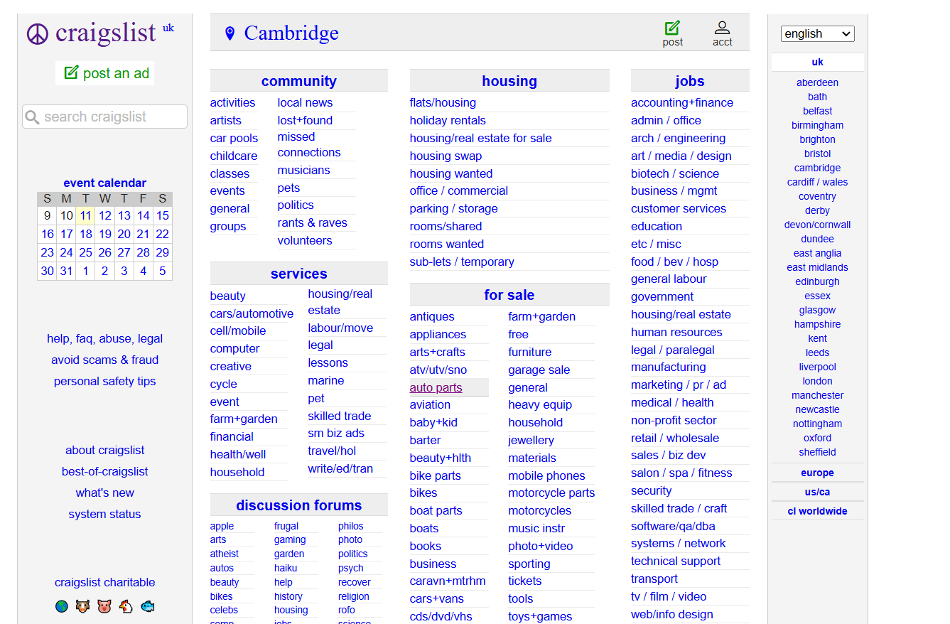
Craigslist has been the easy "bad UX" punchline for two decades, and yet it still pulls hundreds of millions of monthly visits. So is it really bad UX?
It is, but with a caveat. Craigslist works because intent is so strong it overrides bad UX. Someone looking for a cheap apartment in Brooklyn will fight any interface to find it. B2B teams do not have that luxury. No one types "Webflow agency" with the same urgency.
The pattern to name: information density without hierarchy. Everything is on the page. Nothing is prioritized. The user has to do all the work. On a site where intent is weaker, that approach kills conversions before they start.
Ling's Cars
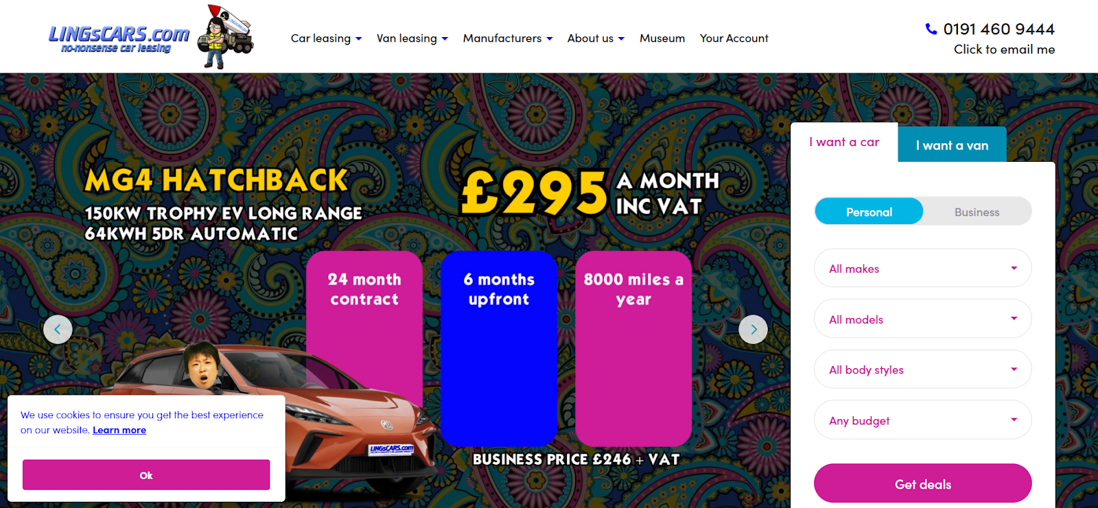
Ling's Cars is the case study for "personal brand cannot save bad UX." Owner has built a cult following on YouTube and social media, but the site itself is a museum to chaos: cartoon cars, neon overlays, a mega menu that takes you to entirely separate domains, and a "Museum" section more updated than the actual inventory.
The pattern to name: visual cacophony with no clear next action. The site is also a B2B service (car leasing) that needs to convert. None of the loud noise points to a contact form, a price, or a quote.
If your homepage looks like a 2003 GeoCities page in 2026, the only people staying are the people who came for the meme. They are not the buyers.
A Modern B2B SaaS (Anonymized From a Recent Audit)
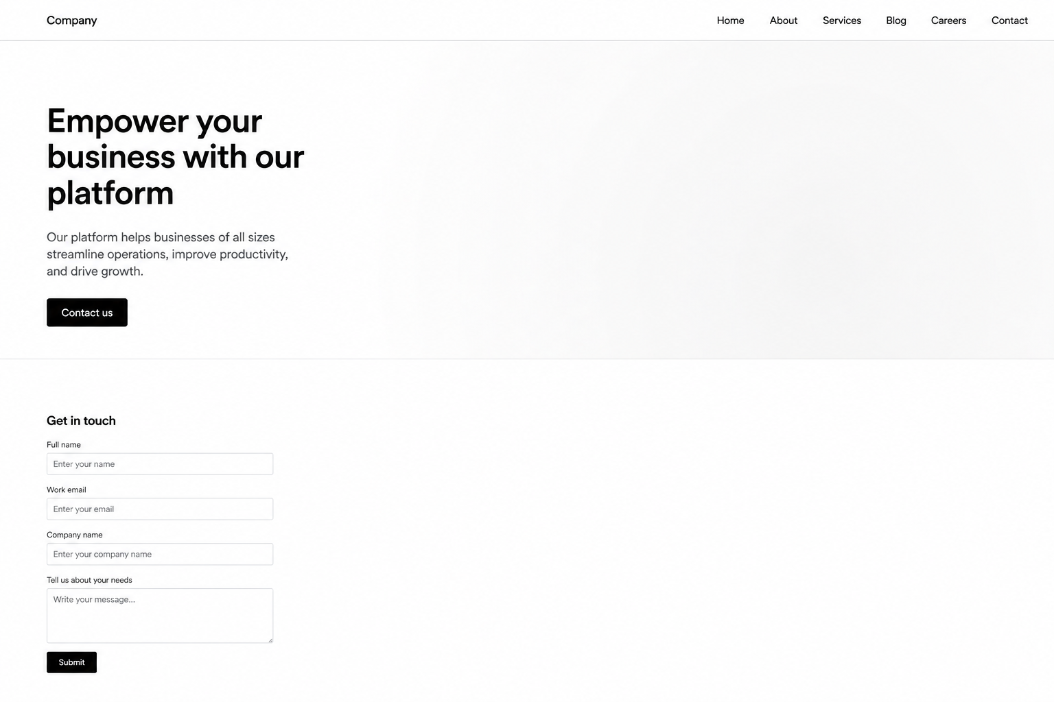
We audited a Series B SaaS site last quarter. The hero said "Empower your business with our platform." There was no product screenshot above the fold, just an abstract gradient. The primary CTA was "Contact us." The logo strip showed four "trusted by" companies, three of which were partners, not customers.
This is the most common pattern we see: vague positioning, missing product visual, weak social proof. It is also the most fixable. A 90-minute workshop on hero copy can move conversion 15-30% before any redesign starts.
The lesson for B2B marketers: most "bad UX" we audit is not actually a design problem. It is a positioning problem dressed up in pixels.
ZARA
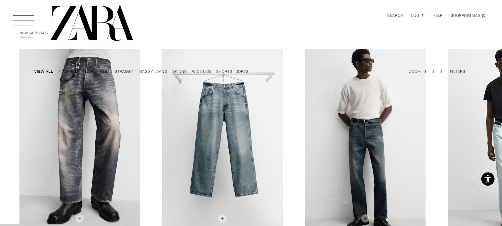
ZARA's site is editorial-first, commerce-second. Big lifestyle photography. A near-empty homepage. A hamburger menu hiding the entire category structure on a category-heavy retailer.
That works for brand-building. It actively fights conversion. The sticky logo blocks part of the viewport on scroll, the jump buttons disappear once you start exploring, and the navigation hides exactly the thing the user came for.
ZARA dresses you. The website hopes you find the dressing room on your own.
The pattern to name: brand-led design that buries product navigation. (ZARA has since made its category navigation more prominent, which only proves the point that even committed brands eventually correct for it.) For a fashion brand operating at ZARA's scale, the design choices are deliberate. For a B2B SaaS or fintech, copying that aesthetic is malpractice.
Yale School of Art
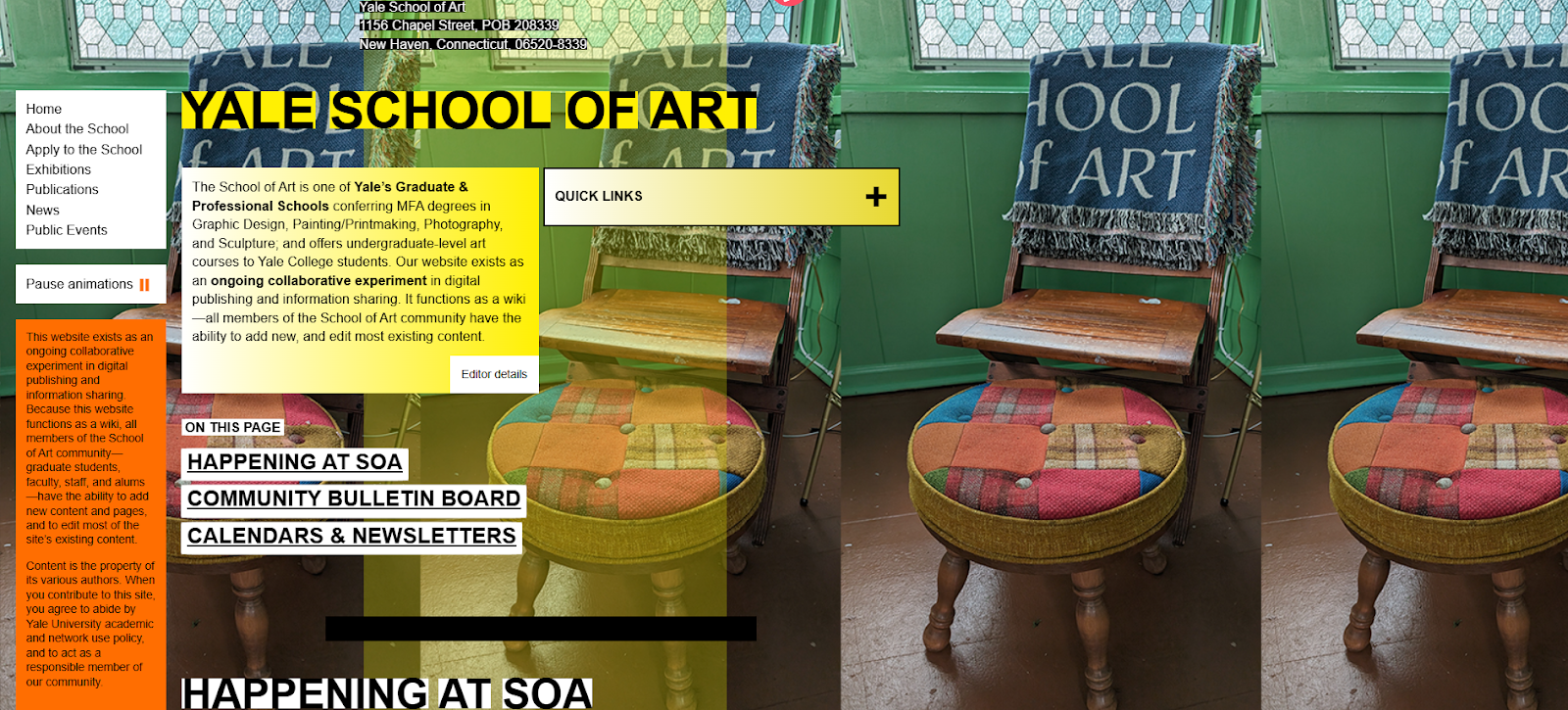
The Yale School of Art site looks broken on purpose. Sections feel scattered, fonts collide, the only sensible navigation is a tiny "Quick Links" panel.
Here is the twist. It is intentional. The site is built and maintained by Yale art students as part of the curriculum. The "anti-design" aesthetic is the message.
That is the lesson. Bad UX is not a universal label, it is a function of audience expectation. Yale's site works because its audience expects something unconventional. The same design choices on a fintech site selling to a CFO would be career-ending.
Context decides if a UX choice is bad. We see B2B teams forget that all the time.
4 Good UX Design Examples (Updated for 2026)
We've replaced the worn-out picks (Apple, Amazon, Airbnb) with examples that actually map to a B2B marketer's reality.
Linear
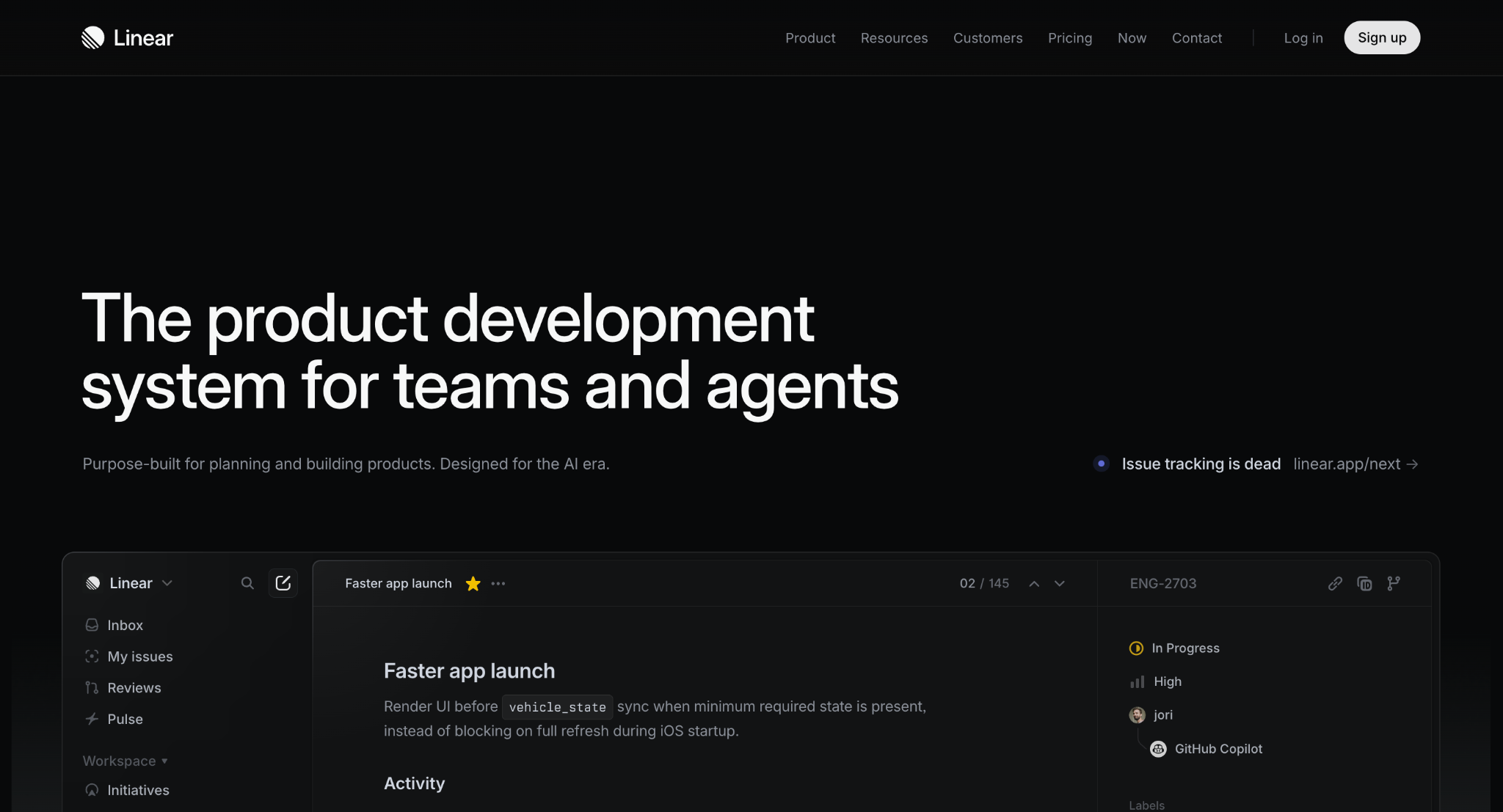
Linear is the modern SaaS UX benchmark. Reportedly valued around $400M with cult-status among product teams, all on roughly $35K of lifetime ad spend (per Eleken's Linear case study). They built a brand by obsessing over speed, focus, and information hierarchy.
The pattern to highlight: opinionated minimalism. Every interaction feels under 100 ms. The visual system is consistent across web and product. The homepage tells you exactly what Linear is and what it is not.
For B2B marketers, the lesson is direct. Linear's UX wins because it removes everything except the next decision. Less is not aesthetic. Less is conversion strategy.
Stripe
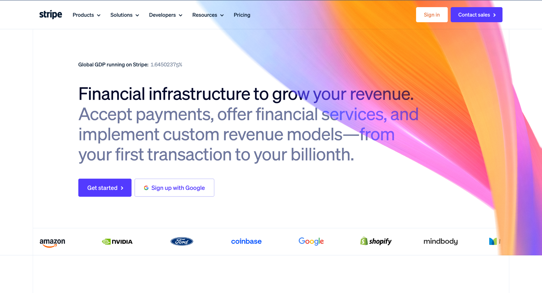
Stripe is the canonical B2B SaaS site. Clear value proposition above the fold. Customer logos that everyone recognizes (Shopify, Amazon, OpenAI). Modular navigation that handles 30+ products without confusing anyone.
Every section opens on outcomes: speed, automation, growth, and not features or jargon. The homepage is the pitch deck, and Stripe treats it that way.
Stripe proves that B2B SaaS UX is not about being fancy. It is about being legible. Every choice on the page either clarifies or it goes.
Notion
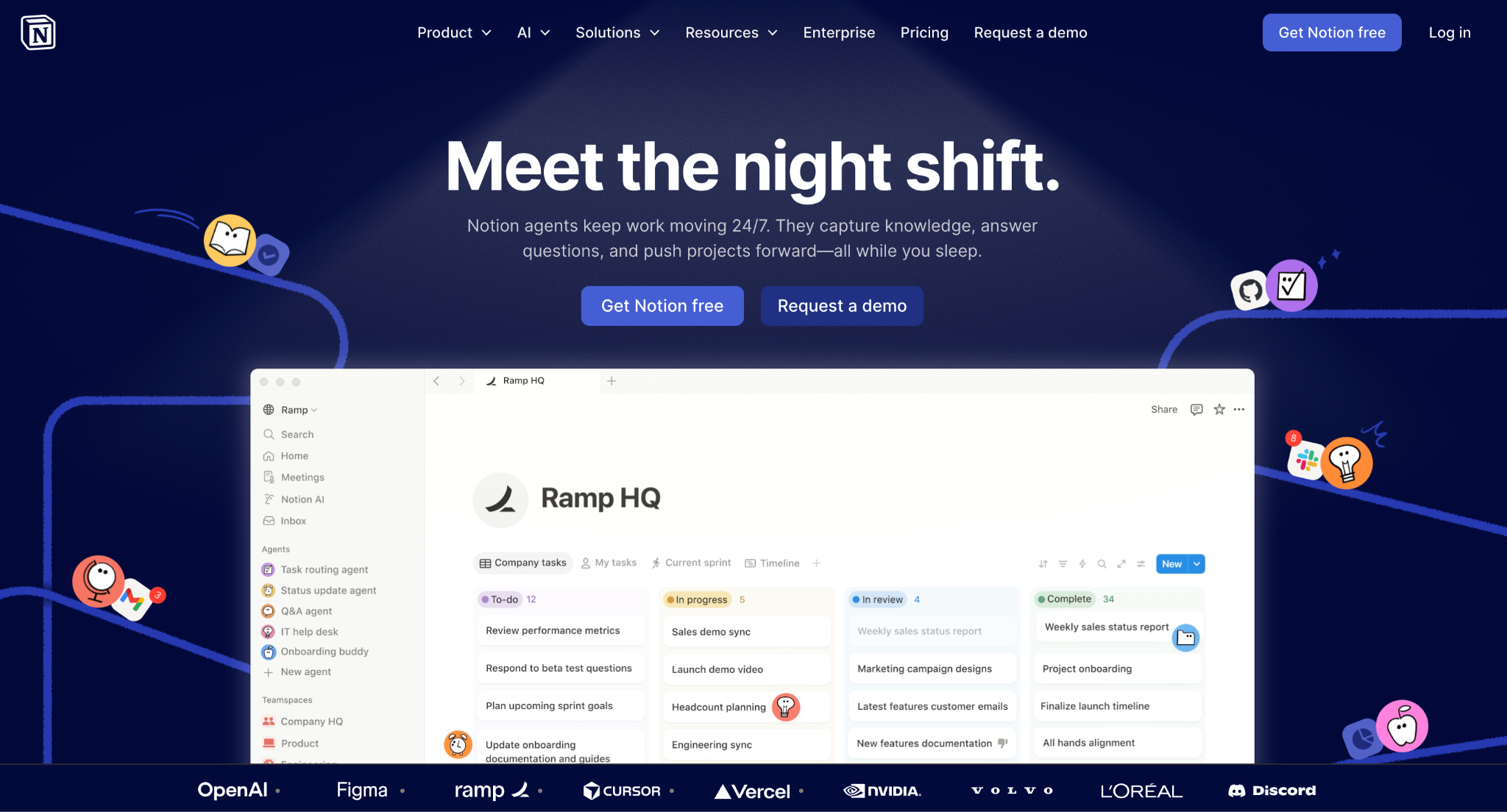
Notion sells a workspace, a wiki, a database, and an AI tool. That is a brutally hard story to tell on one homepage. Most companies with that range either confuse people or hide half their product.
Notion does neither. The homepage uses progressive disclosure: the use cases live above the fold, the deeper feature pages explain the how. Inline product previews replace static screenshots. Customer logos are used surgically, not stuffed into a wall.
Complex products do not require complex sites. Notion's homepage is proof.
How Flow Ninja Builds Good UX (Three Real Case Studies)
The examples above are public benchmarks. The three below are sites we built ourselves. We are including them because none of the competing articles on this topic ship with real client outcomes attached. We think they should.
Every number in this section is verified and links to the public case studies on our work page.
Trustly: Building Global UX for a 16-Locale Fintech
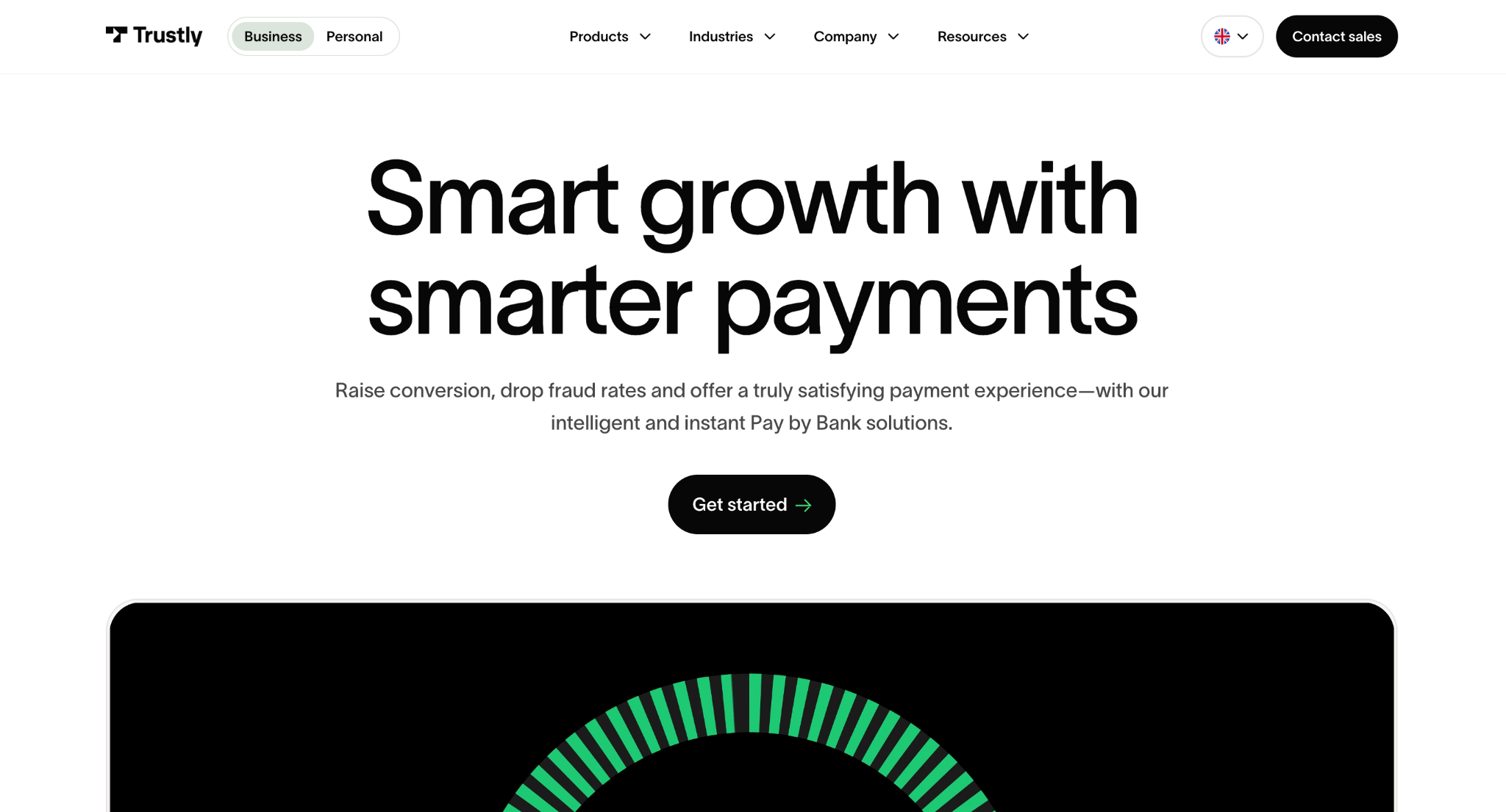
Trustly came to us with a fragmented site spread across 16 locales. B2C and B2B journeys were colliding on the same templates. The architecture was slow, inconsistent, and expensive to maintain.
We rebuilt on Webflow with a unified component system, separated the B2B and B2C journeys, and scaled the localization model. The outcomes:
- $100K in annual cost savings
- 16 locales served from one platform
- Faster go-to-market across all markets
The lesson for any B2B leader looking at a similar problem: good UX at scale is a system, not a redesign. Fix the architecture and the journey fixes itself. Deep dive on the Trustly case study.
This is the same playbook we apply across our finance and fintech expertise.
Giftify: Turning Engagement Into a UX Metric
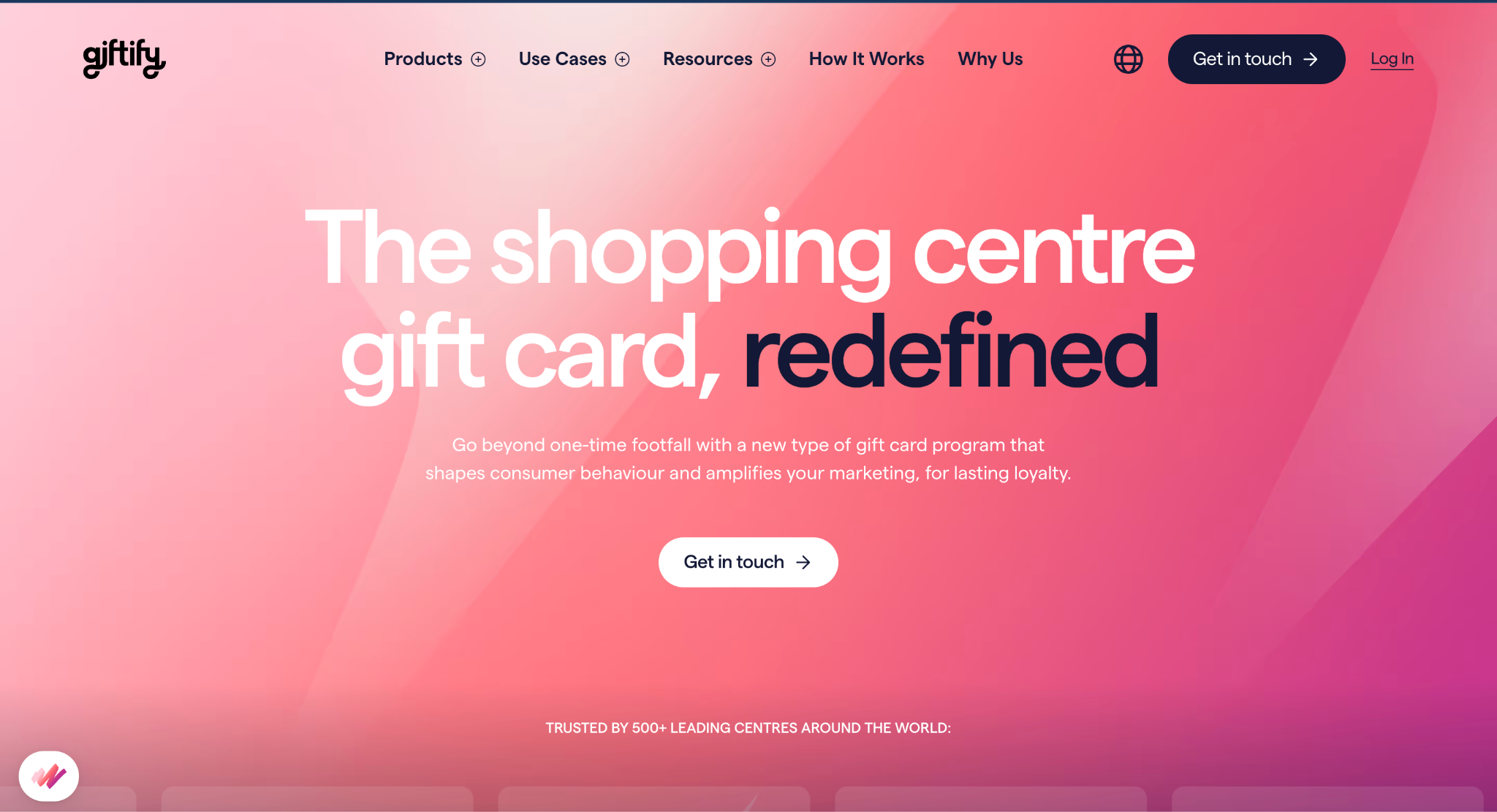
Giftify needed users to spend more time exploring products and discovering use cases, not just landing and bouncing. Engagement was the UX KPI from day one.
We redesigned the discovery patterns, optimized internal navigation flow, and rebuilt the page architecture around how users actually moved through the site. The numbers we measured after launch:
- 67% increase in engagement time
- 33% increase in pages per user
- 2.9x website traffic growth
The lesson is sharper than it sounds. Engagement time is a UX KPI. If your users are not spending more time on the site after a redesign, the UX did not improve, no matter how much the moodboard impresses your team. Full breakdown on the Giftify case study.
6 Bad UX Patterns We See in 90% of B2B Audits
We've audited over 100 Webflow sites and read pre-redesign briefs from another few hundred. The same six patterns show up almost every time. Here is the list, with the fix.
| Pattern | What it costs | Quick fix |
|---|---|---|
| Hero headline talks about the company, not the customer ("We are the leading platform for X") | Visitors leave before scrolling. The headline answers the wrong question. | Rewrite the headline as a customer outcome with a number ("Cut X cost by 30% in 60 days") |
| Primary CTA reads "Submit" or "Contact us" | Friction at the most important moment. The button asks for effort, not value. | Change CTA copy to the outcome ("Get my free audit", "Book a 20-min demo") |
| No product visual above the fold (or a generic stock photo) | Visitors cannot tell what the product is. Trust collapses in the first few seconds. | Add a real product screenshot or a 6-second loop video. Show the thing |
| Top nav hides Pricing, Demo, or Case studies | Buyers who want to evaluate cannot find the evaluation pages. They leave. | Surface Pricing or Demo in the top nav. Pricing should be no more than 2 clicks away |
| LCP slower than 2.5 seconds on the homepage | Bounce rate climbs, search rankings drop, conversion follows. | Compress hero media, defer non-critical scripts, audit fonts. CWV is non-negotiable in 2026 |
| Logo strip filled with partners, not customers | Social proof is fake-feeling. Buyers notice immediately. | Use 4-6 actual customer logos. If you do not have them yet, use named case study quotes instead |
These six patterns alone account for most of the conversion gap we see between average and high-performing B2B sites.
Quick UX Audit Checklist (10 Things to Check on Your Site Today)
Run this checklist on your homepage. Mark each as a yes or a no. If you score under 7, you are leaking pipeline.
- Time to first meaningful paint is under 2.5 seconds
- Headline names the customer outcome, not the company
- Real product visual above the fold (screenshot or short video)
- Primary CTA is visible without scrolling, with outcome-oriented copy
- Customer logos visible in the first viewport
- Mobile nav surfaces the 3-5 most important destinations, not everything
- Pricing page is no more than 2 clicks from the homepage
- Forms ask for the minimum: name, email, one qualifier max for top-of-funnel
- Every section opens with a benefit, not a feature
- Color contrast hits WCAG AA at minimum
If you scored less than 7 out of 10, you are leaking pipeline. We've helped over 100 B2B teams fix this exact gap. If you want a second pair of eyes on it, book a free strategy call.
Bad UX vs Good UX at a Glance
The same eight elements separate sites that convert from sites that frustrate. This table is the cheat sheet.
| UX Element | Bad UX | Good UX |
|---|---|---|
| Hero headline | "We're the leading X platform" | "Cut your X cost by 30% in 60 days" |
| Primary CTA | "Submit" / "Contact us" | "Get my audit" / "Book a demo" |
| Above the fold | Generic stock photo or gradient | Real product screenshot or short video |
| Navigation | 12+ flat links, no grouping | 5 grouped menus with clear labels |
| Customer proof | "Trusted by businesses worldwide" | 4-6 recognizable customer logos |
| Page speed (LCP) | 4-5 seconds | Under 2.5 seconds |
| Forms | 8 fields, 2 dropdowns | 3 fields max for top-of-funnel |
| Mobile experience | Desktop with smaller text | Reordered layout, thumb-friendly CTAs |
This is the table we walk every client through in the first 30 minutes of a UX strategy session. Most teams find at least four rows where they are firmly on the bad side.
Stop Letting Bad UX Cost You Pipeline
Most marketing leaders we talk to know their UX is leaking. They just do not know where, or what to fix first.
Every site we've shipped (Trustly, Giftify, 21Shares, and many more on our case studies page) followed the same playbook in this article. Clear positioning, real product visuals, fast load, frictionless next step, and a measurement system that proves it worked.
If your site is somewhere on the bad-UX side of the table above, we should talk. Book a free strategy call and we will walk through your homepage together. If you would rather start without a call, our free Foresight AI audit will give you a starting point in under two minutes.
Either way, the 50-millisecond clock starts the moment a visitor lands. Make the first impression worth the next scroll.
{{foresight-component}}
FAQ
What is bad UX in simple terms?
Bad UX is when a user has to think about your interface instead of their goal. It looks like vague headlines, hidden navigation, slow loading, unclear CTAs, and friction at every step. On a B2B site, the most common version is a homepage with a contact form as the only call to action. The visitor has no way to learn before committing, so most of them never commit.
What is good UX in simple terms?
Good UX is when the next correct action is obvious and fast. The headline tells the visitor what they get, the value is visible above the fold, the page loads under two seconds, and the next step is one click away. On a B2B site, that usually looks like a clear demo CTA above the fold with a recognizable customer logo or a short product video next to it.
How does bad UX hurt my B2B website's pipeline?
Bad UX does not lose you customers. It loses you the chance to be considered. The 50-millisecond first-impression decision happens before any product evaluation. Slow pages drop conversion 7% per 100ms of latency, missing or vague hero content kills demo signups, and weak social proof shortens the time visitors spend evaluating you. The result is fewer MQLs and longer sales cycles.
How do I audit my own website's UX?
A useful UX audit answers three questions: is it fast, is it clear, is the next step obvious? Run our 10-point UX checklist on your homepage. Then do the same for your top 3 landing pages and your pricing page. Anything below 7 out of 10 is a priority fix. If you want a second pair of eyes on it, our team does this for free with the Foresight AI audit.
Is good UX expensive?
Good UX is cheaper than bad UX. The expensive thing is rebuilding twice because you skipped strategy the first time. Most fixes we ship are clarifications, not redesigns: a sharper headline, a clearer CTA, a faster hero load. 21Shares saved $300K+ a year and shipped faster simply by simplifying their stack. The full redesign was a fraction of what they had been losing to slow execution.
What's the difference between UX and UI?
UI is what the user sees. UX is what the user feels when using it. A beautiful UI on a slow site is still bad UX, because what the visitor feels is friction. Most B2B sites we audit have decent UI and broken UX. They look fine in screenshots and underperform in analytics, which is exactly the gap a UX-first redesign closes.
How often should we redesign for UX?
Most B2B sites do not need a redesign every two or three years. They need a continuous UX operation. Small, weekly improvements compound: a hero test this week, a nav simplification next week, a CTA rewrite the week after. That is the model behind our WebOps service, and it is why our clients ship UX improvements every week instead of waiting quarters.
What's the difference between good UI and bad UI?
UI is the surface layer (buttons, forms, color, typography, spacing), while UX is the end-to-end experience of using the product. Good UI uses consistent components, obvious tap and click targets, sufficient color contrast, and clear states (hover, error, loading) so users always know what is interactive and what happened after they acted. Bad UI shows up as ambiguous buttons, inconsistent styling between pages, low-contrast text, and missing feedback after an action. A product can have polished UI and still deliver bad UX, which is why the two get audited separately.
Can you give real examples of good UI vs bad UI?
At the interface level, good UI looks like Stripe's form fields (clear labels, inline validation, obvious primary buttons) or Linear's consistent, high-contrast component system. Bad UI shows up in patterns like disabled-looking buttons that are actually clickable, forms that clear every field after one validation error, or icon-only navigation with no labels. The examples elsewhere on this page are whole-site UX comparisons; UI-level problems are smaller and faster to fix (a color, a label, a state), which is often the right first step before a full redesign.

Sara Stojmenovic
Sara is a Design Lead at Flow Ninja. She can also outscore everyone in the team at the shooting range, having trained shooting sports for a long time.


See your website the way a senior strategist does
Foresight scans your site across 10 strategy dimensions. You get a scored breakdown of every gap costing you leads.
Continue reading
.webp)










Ready to escape your CMS nightmare
100+ successful migrations. 0 ranking disasters at launch. One embedded team that's done this before.